Page 1 of 1
KCPD logo
Posted: Thu Feb 14, 2013 11:11 am
by voltopt
I noticed a KCPD patrol car today with this logo.
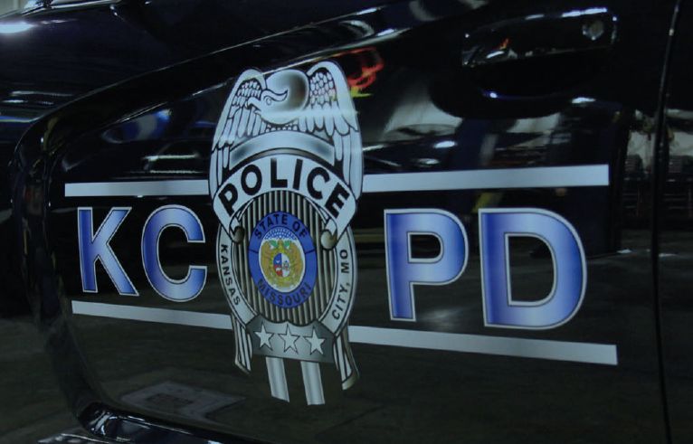
While exciting, one thing I've always liked is the simple font and Upper/lower case of Police, which is simply and cleanly marked on many patrol cars and paddy wagons. It is either black on an white background, or white on a black or dark blue.

I've also always liked how it clearly just says Police KC/MO - the slash is nice, and I understand it to denote a state run local police department.
I know it isn't a huge deal, but I'd hate to see it change to this more extravagant, loud and ugly logo.
Re: KCPD logo
Posted: Thu Feb 14, 2013 12:30 pm
by KCMax
It will soon be "KCPD Presented by Outback Steakhouse."
Re: KCPD logo
Posted: Thu Feb 14, 2013 12:36 pm
by staubio
I totally agree. The existing simple demarcation was befitting a big city police force and its officers. When you think of the most notable police "brands," simple, classic typography is the norm.
Re: KCPD logo
Posted: Thu Feb 14, 2013 12:36 pm
by kboish
KCPD, brought to you by Krispy Kreme.
To easy
Re: KCPD logo
Posted: Thu Feb 14, 2013 1:10 pm
by chaglang
staubio wrote:I totally agree. The existing simple demarcation was befitting a big city police force and its officers. When you think of the most notable police "brands," simple, classic typography is the norm.
Agree. I loved the Boston Police's use of Futura Black.
Re: KCPD logo
Posted: Thu Feb 14, 2013 3:07 pm
by Joe Smith
voltopt wrote:I noticed a KCPD patrol car today with this logo.
While exciting, one thing I've always liked is the simple font and Upper/lower case of Police, which is simply and cleanly marked on many patrol cars and paddy wagons. It is either black on an white background, or white on a black or dark blue.
I've also always liked how it clearly just says Police KC/MO - the slash is nice, and I understand it to denote a state run local police department.
I know it isn't a huge deal, but I'd hate to see it change to this more extravagant, loud and ugly logo.
You stole my pic. you bastard.
I'm kidding. I don't really know if you're a bastard or not.
The new design has been out for awhile, but the cars haven't been out much.
The white one was sitting in the parking lot of a secret Federal mini skunk work commo/weapons joint on 17th and Troost. They do all sort of mysterious things there.
As for the slash, I don't think your story is correct.
I miss the days of the multicolors. The KCPD had 4-5 different colors they used on their patrol cars. One color per car. I also still wish that they drove 6-cylinder Dodge Diplomats.
Re: KCPD logo
Posted: Thu Feb 14, 2013 3:20 pm
by Eon Blue
The new logo is a little too Word-Arty, like something I would have put in a high school powerpoint.
Re: KCPD logo
Posted: Thu Feb 14, 2013 3:29 pm
by Joe Smith
Eon Blue wrote:The new logo is a little too Word-Arty, like something I would have put in a high school powerpoint.
I disagree.
They look modern and cool. You really should see what everyone else is doing or not doing.
http://www.flickr.com/groups/backtheblue/
http://www.flickr.com/groups/policecars/
http://www.flickr.com/groups/policevehicles/
Re: KCPD logo
Posted: Thu Feb 14, 2013 3:33 pm
by chaglang
Eon Blue wrote:The new logo is a little too Word-Arty, like something I would have put in a high school powerpoint.
Get crazy with the gradient tool!
Re: KCPD logo
Posted: Thu Feb 14, 2013 4:52 pm
by pash
.
Re: KCPD logo
Posted: Thu Feb 14, 2013 5:10 pm
by shinatoo
Looks like it was done by the Joe Herndon VoTech school. They do good work for a VoTech. Maybe it was done by the prison system.
http://www.dailymail.co.uk/news/article ... e-car.html
Re: KCPD logo
Posted: Thu Feb 14, 2013 5:52 pm
by KCLofts
Prior to going back to the just the Police font, they also used the rainbow stripe design on the Crown Vics as featured on that oil TV commercial. That design must have been retired with the Crown Vic.
Re: KCPD logo
Posted: Sat Feb 16, 2013 5:07 pm
by flyingember
Re: KCPD logo
Posted: Sat Feb 16, 2013 6:56 pm
by Joe Smith
I just assumed that everyone who's from K.C. knew it was an image of their badge. K.C. has one of the better badge designs in the country. Not quite iconic like L.A. or N.Y., but a nice design nonetheless.
Re: KCPD logo
Posted: Sat Feb 16, 2013 8:39 pm
by flyingember
Joe Smith wrote:
I just assumed that everyone who's from K.C. knew it was an image of their badge. K.C. has one of the better badge designs in the country. Not quite iconic like L.A. or N.Y., but a nice design nonetheless.
I've been in KC for 7 years and didn't have any idea.
I lived in Liberty for 20 years and I still don't know what their badge looks like. I also know their chief of police from boy scouts.
I bet 95% of people in both cities are like me.
Re: KCPD logo
Posted: Sun Feb 17, 2013 5:53 pm
by Joe Smith
From 2009
The two in the middle and the officer on the right are wearing the 135th Anniversary Commemorative badges. They must pay for them out of their own pocket and can wear them in uniform until 12/31/09
The officer on the left is wearing the regular KCPD badge.
Btw, This is the second time, I think, that the KCPD has come out with these commemorative badges. I think they did the same thing about 5 years ago. The badges here look to be the same design as the ones from 5 years ago.

KCPD badges should not be confused with these Police badges.


This one here sat over the front entrance to KCPD HQ. With the remodeling being done, hopefully they'll restore it and give it some color. Notice the similar stylized Eagle that is almost exactly the same as the ones on their current badges.

In this long distance shot from 2009, notice the KCPD badge graphic on the side of one of their old Ghetto Birds.

Hopefully the KCPD will also update the livery on their motorcycles as well. The design is plain and boring.
