Page 6 of 8
Re: The KC City Flag
Posted: Fri May 31, 2019 9:47 am
by TheLastGentleman
So, when are we campaigning for my flag?
Re: The KC City Flag
Posted: Fri May 31, 2019 10:11 am
by rxlexi
So, when are we campaigning for my flag?
Whether your flag, the new interlocked KC "logo", or something else entirely, we really do need an updated city flag folks can get behind. Meaningful official branding.
How does one go about petitioning for this change? You would think it may have crossed a few minds when updating the logo a couple of years back?
Re: The KC City Flag
Posted: Fri May 31, 2019 10:12 am
by rxlexi
And for the record, I also quite like the Critical Mass city flag - western MO spin on the STL twin rivers design. Elegant.
Re: The KC City Flag
Posted: Fri May 31, 2019 10:18 am
by TrolliKC
TheLastGentleman wrote: ↑Wed Oct 25, 2017 9:39 pm
While I'd be fine with either of the designs I've submitted here, I think I actually like the first one a bit better....

The fountain is just framed better IMO. I can see the appeal of the exact triangles of the second one though.
TLG I think we should crowdfund a mural of this on a building downtown, then start selling t-shirts. Any ideas which building?
Re: The KC City Flag
Posted: Fri May 31, 2019 10:24 am
by shinatoo
TrolliKC wrote: ↑Fri May 31, 2019 10:18 am
TheLastGentleman wrote: ↑Wed Oct 25, 2017 9:39 pm
While I'd be fine with either of the designs I've submitted here, I think I actually like the first one a bit better....
The fountain is just framed better IMO. I can see the appeal of the exact triangles of the second one though.
TLG I think we should crowdfund a mural of this on a building downtown, then start selling t-shirts. Any ideas which building?
I like this one or some form of it. (The blocking of the red and blue seam a little off to me, but not worth fighting over). Wouldn't be as high contrast on other media such as cloth or a building, so probably wouldn't feel as rough. Only other change I would make would be to add some color to the fountain heart logo. Maybe figure out some way to make the four diamonds in the logo represent something?
Re: The KC City Flag
Posted: Fri May 31, 2019 10:27 am
by kcjak
Will never be a fan of the current heart/fountain image - feels like the 70s.
Re: The KC City Flag
Posted: Fri May 31, 2019 10:30 am
by shinatoo
kcjak wrote: ↑Fri May 31, 2019 10:27 am
Will never be a fan of the current heart/fountain image - feels like the 70s.
The logo in the 70s-80s was the knot. The fountain wasn't adopted unit 1992
Re: The KC City Flag
Posted: Fri May 31, 2019 2:09 pm
by Critical_Mass
shinatoo wrote: ↑Fri May 31, 2019 10:30 am
kcjak wrote: ↑Fri May 31, 2019 10:27 am
Will never be a fan of the current heart/fountain image - feels like the 70s.
The logo in the 70s-80s was the knot. The fountain wasn't adopted unit 1992
So, the 70s knot design is vintage enough that it's cool again, whereas the 90s heart fountain is in the lame period of it's lifecycle.
Re: The KC City Flag
Posted: Wed Jun 05, 2019 5:47 am
by chaglang
Isn’t that the current city flag with the red and blue blocks skewed?
Does is need to be red/white/blue? Some of the more interesting flags posted here have been shades of those colors.
I’m not a fan of the fountain heart thing - too clip art for me - but if it’s used it should be a bit smaller on the flag. The proportions make it look squeezed.
Re: The KC City Flag
Posted: Mon Jun 15, 2020 3:33 pm
by shinatoo
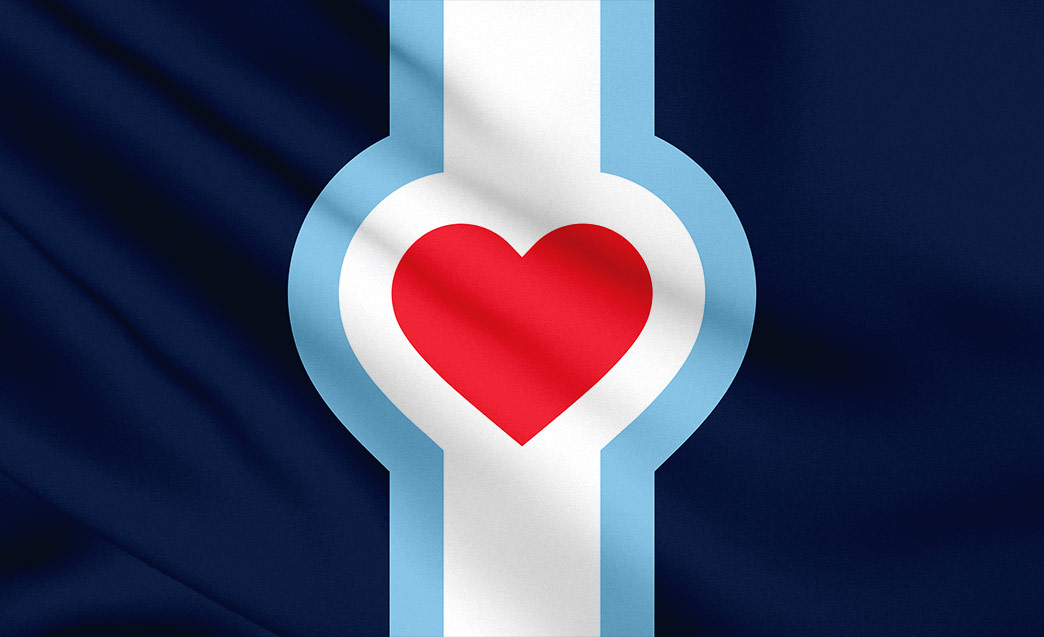
Anyone else seen this?
https://kcflag.org/
Re: The KC City Flag
Posted: Mon Jun 15, 2020 3:37 pm
by brewcrew1000
Looks like it was designed by someone from Chicago and replaced stars with a big heart
Re: The KC City Flag
Posted: Mon Jun 15, 2020 4:12 pm
by TheLastGentleman
I like the overall format of a shape being bracketed by other designs, but I'm not sold on the heart. A bit too on the nose. Are there any other good Kansas City shapes to pick from?
Re: The KC City Flag
Posted: Mon Jun 15, 2020 4:18 pm
by Critical_Mass
I like it a lot!
Though should we just go ahead and make the Charlie Hustle one official?

Re: The KC City Flag
Posted: Mon Jun 15, 2020 4:22 pm
by TheLastGentleman
I think that might be breaking the no-text rule of flag design
Re: The KC City Flag
Posted: Mon Jun 15, 2020 5:27 pm
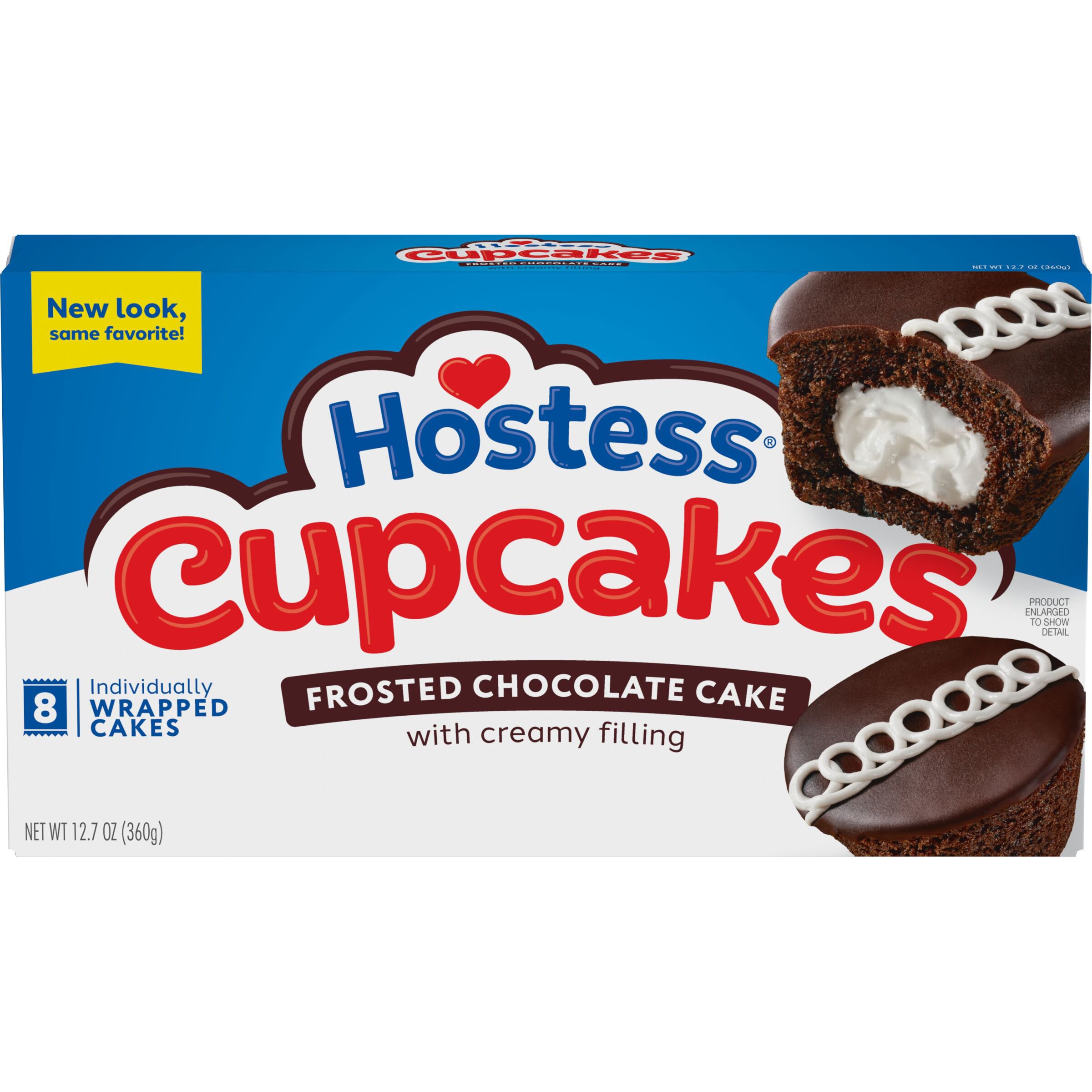
by grovester
TheLastGentleman wrote: ↑Mon Jun 15, 2020 4:12 pm
I like the overall format of a shape being bracketed by other designs, but I'm not sold on the heart. A bit too on the nose. Are there any other good Kansas City shapes to pick from?
Makes me want to eat some Hostess products.
Re: The KC City Flag
Posted: Mon Jun 15, 2020 5:31 pm
by TheLastGentleman
grovester wrote: ↑Mon Jun 15, 2020 5:27 pmMakes me want to eat some Hostess products.
Re: The KC City Flag
Posted: Mon Jun 15, 2020 7:10 pm
by grovester
It's disturbing that I recognized that subliminally.
Re: The KC City Flag
Posted: Mon Jun 15, 2020 8:06 pm
by shinatoo
the red heart is too much, maybe just a red outline. IDK.
Re: The KC City Flag
Posted: Mon Jun 15, 2020 8:10 pm
by FangKC
Isn't the red heart to symbolize the Heart of America?
Re: The KC City Flag
Posted: Mon Jun 15, 2020 9:58 pm
by earthling
Have never been a fan of the Heart of America marketing. And the one above signifies to me a dividing line rather than unity.
Go bold, break all the 'rules' and develop a digital flag as animated line drawing GIF that represents roots of a Lewis/Clark path to railroad river town transitioning into modern streetcar/smart city or something forward/futurist. And a static variation as well.