Hey so I had some free time tonight and I was messing around with some graphics designs for a logo for this website (i assume you're still looking for one) and wanted to get your input. I didn't really know what color scheme, size constraints, etc are needed for the site or how serious/corny. So, be honest and just lemme know what you think.
I registered free space with freeservers.com to upload and link the images but they apparently don't allow remote linking (doh!) so, you'll have to click on the link to see the logos on a temp page i created...
http://kcteen.freeservers.com
BTW, more detail (like the art deco on the bartle towers and such which is currently not there) could be added to the cutout if desired.
-KcTeen
Logo ideas
-
KCPowercat
- Ambassador
- Posts: 34032
- Joined: Mon Oct 07, 2002 12:49 pm
- Location: Quality Hill
- Contact:
Logo ideas
I like those a LOT for banner ideas.....now if we can somehow take that idea and make it into a small logo kind of like something like this:

to be used as a small version of the logo....
I really like the cutout and the one with colors behind it.
Awesome job.....see if you can make a smaller version too w/o the website address like the one from denverskyscrapers.com above....I like it though.
to be used as a small version of the logo....
I really like the cutout and the one with colors behind it.
Awesome job.....see if you can make a smaller version too w/o the website address like the one from denverskyscrapers.com above....I like it though.
Logo ideas
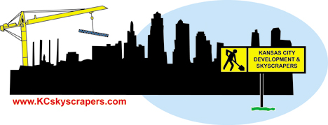
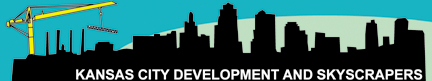
well I added three more smaller "logos" to the http://kcteen.freeservers.com site.
They are pretty much the same as the other ones, I didn't have time to restart from scratch (they all use the same basic graphic, just are resized and re-layed out a little.)
I will try thinking of things more along the "denver" line.
If you have any specific ideas, please post 'em.
BTW, all the graphics are 100% vector based so they can be stretched, resized, etc and re-rasterized for the web without loss in quality. The seperate elements are layered and can be taken off, more layers can be added, and colors could be changed very easily.
KcTeen
-
Anonymous
Logo ideas
I really like this one. Can you add some tower cranes to it maybe to symbolize the purpose of the site?

-
KCPowercat
- Ambassador
- Posts: 34032
- Joined: Mon Oct 07, 2002 12:49 pm
- Location: Quality Hill
- Contact:
Logo ideas
I like that one too and the cranes are a great idea......maybe change the colors to match what are on the front site...like those aqua colors somehow???
Logo ideas
How the heck did you get the image to link? darnit, It wouldn't work for me...lol
I'll see what I can do with the cranes, the "construction" motif was the initial idea with the yellow construction-type sign as in the first graphic on the site. I'll see if I can't get some cranes going.
I'll make a version with the aqua colors, too.
KcTeen
I'll see what I can do with the cranes, the "construction" motif was the initial idea with the yellow construction-type sign as in the first graphic on the site. I'll see if I can't get some cranes going.
I'll make a version with the aqua colors, too.
KcTeen
-
KCgridlock
Logo ideas
How about something like this. I very quickly did this, so take it for what it’s worth.

-
KCPowercat
- Ambassador
- Posts: 34032
- Joined: Mon Oct 07, 2002 12:49 pm
- Location: Quality Hill
- Contact:
Logo ideas
I like the one on the right, the one on the left needs to be moved further to the left of the sky stations.
-
KCPowercat
- Ambassador
- Posts: 34032
- Joined: Mon Oct 07, 2002 12:49 pm
- Location: Quality Hill
- Contact:
Logo ideas
you know to signify Waddell & Reed's HQ by PAC 

-
KCPowercat
- Ambassador
- Posts: 34032
- Joined: Mon Oct 07, 2002 12:49 pm
- Location: Quality Hill
- Contact:
Logo ideas
well I was thinking all the way to the left to the left of the stations to not hide what's already in the skyline...but that works too.
Now, to think of a small logo, the banner ad looks like it's coming together, I just want something that in one picture, is a logo for the site...similiar to denverskyscrapers.com above but also something to tie into what kcteen as done.
Now, to think of a small logo, the banner ad looks like it's coming together, I just want something that in one picture, is a logo for the site...similiar to denverskyscrapers.com above but also something to tie into what kcteen as done.
Logo ideas
Ah KCgridlock you beat me to it!
I drew a quick crane and put it in two of them..they're a little cartoonish but I think they're not bad
The new drawings are beneath the old ones on the bottom of http://kcteen.freeservers.com
tell me what you think.
BTW if you ever wanted to add flash to the site all these ideas could easily be animated as the individual components are seperate and vector based (perfect for flash)...
-KcTeen
-
KCgridlock
Logo ideas
kcteen, don't think I want to steal your idea. Just thoght it was cool and wanted to improve it.
Here are the ones you made:I kinda like the "cartoon" cranes, but like the ones I made too. Anybody???
Here are the ones you made:I kinda like the "cartoon" cranes, but like the ones I made too. Anybody???
Logo ideas
KCgridlock--i didn't think you were stealing my idea! I encourage anybody to modify/redo what I have posted if they want to try to improve upon it! I was surprised how quickly you did it...! It takes me longer to do even the simplest designs...
I think both sets of cranes are fine. I am thinking I am going to make a second "cartoonish" crane that is a little different to compliment the first to try out. If i like it i'll post it. Did you like the new color scheme on the bottom banner?
For a logo, I personally like the KCPL building cutout on the red/blue background that KC made earlier. Perhaps that shape, with a different set of colors (scratch the blue and red), or maybe if it were rearranged somewhat, would be the best simple logo for the site. I can reproduce it with some other color schemes if you would want.(?)
We need some other opinions..! Unfortunetly, I don't think many people read this forum when they come on the site...
KcTeen
Logo ideas
Grid, I like that idea a lot (the one that shows up).
But I can't see any other designs...is it just me or are they not working. Get that fixed so I can put in my 2 cents
But I can't see any other designs...is it just me or are they not working. Get that fixed so I can put in my 2 cents
-
KCPowercat
- Ambassador
- Posts: 34032
- Joined: Mon Oct 07, 2002 12:49 pm
- Location: Quality Hill
- Contact:
Logo ideas
kcteen....how about this, I really am starting to like the last couple on your site, the one with the oval might be what we need to do both, how about this....this is going to be very rough, so have to imagine a little.

That way use the whole thing as the banner and then use just the oval for the small symbol of the site?
I think I'm liking the all black cranes for the banner although if I were to put together a shockwave something, I would want to use your cartoon cranes as animation....
That way use the whole thing as the banner and then use just the oval for the small symbol of the site?
I think I'm liking the all black cranes for the banner although if I were to put together a shockwave something, I would want to use your cartoon cranes as animation....
Logo ideas
Cool it works now. So here's my 2 cents
I like this one a lot
I like this one a lot
-
SonicBoi

- New York Life

- Posts: 456
- Joined: Thu Jan 30, 2003 2:40 am
- Location: Independence or 2555 Grand, Crown Center
- Contact:
Logo ideas
I like it. But, in my opinion, the crane is a bit cheesey. I perfer the origional or maybe a small crain in the background. Keep up the good work.
SonicBoi
1 Samuel 18:3-4: And Jonathan made a covenant with David because he loved him as himself. Jonathan took off the robe he was wearing and gave it to David, along with his tunic, and even his sword, his bow and his belt.
1 Samuel 18:3-4: And Jonathan made a covenant with David because he loved him as himself. Jonathan took off the robe he was wearing and gave it to David, along with his tunic, and even his sword, his bow and his belt.