Page 4 of 8
Re: The KC City Flag
Posted: Fri Oct 13, 2017 12:58 pm
by Critical_Mass
The fountains should go. Does anyone really think of our hometown as the 'City of Fountains' anymore? To me, it sounds like a contrived idea thought up by the Convention and Visitors bureau in the 70s or 80s.
My incredibly amazing idea:

It represents the Heartland at the confluence of the Missouri and Kansas rivers.
The scheme is borrowed from the St. Louis city flag, our brother / rival on the other side of the state to show our shared missouri / midwest heritage similar to how the Scandinavian nations all have different color-schemes of the Nordic Cross flag.
Re: The KC City Flag
Posted: Fri Oct 13, 2017 1:34 pm
by KCPowercat
I'm really in love with Chicago's idea of an evolving flag where you add to it with significant events...
Re: The KC City Flag
Posted: Fri Oct 13, 2017 9:02 pm
by TheLastGentleman
Something I recently noticed about the fountain that made me like it a bit more was that it actually resembles a heart, with the archs of the water and the point on the bottom. I think that's a much more subtle reference to the heartland than a big heart. I say, get rid of the text and the French color bars and you're golden
Re: The KC City Flag
Posted: Sat Oct 14, 2017 8:02 pm
by longviewmo
HalcyonKC wrote:Wichita's city flag has enough design mojo that there's a movement afoot to make it available as a personalized license plate.
http://www.kansas.com/news/politics-gov ... 64901.html
I'm not sure if Missouri allows such a thing, and even if they did, the current KC flag blows and probably wouldn't lend itself very well to a sharp and distinctive plate design.
The Wichita flag is
literally everywhere in town. ... and plenty of those aren't just the regular flag image. There's stuff like
this mural, which was on a huge chalkboard downtown before it became a permanent fixture in an alley.
Whole storefronts embrace it. This one's doubly cool because of the
Keeper of the Plains silhouette. The artist who designed the statue had his studios at this exact location.
Re: The KC City Flag
Posted: Sun Oct 15, 2017 10:32 pm
by TheLastGentleman
Re: The KC City Flag
Posted: Mon Oct 16, 2017 8:30 am
by HalcyonKC
From the TED talk earlier in the conversation, I think this design would be nixed (as a flag anyway) for the following:
"No lettering or seals - never use writing of any kind." "If you need to write the name of what you're representing on your flag, your symbolism has failed." For us this means, no 'KC' on the flag no matter how tempting that may be--I know others mentioned possibly using it before, but we should avoid it.
"Keep it simple - The flag should be so simple that a child can draw it from memory." "A three by five foot flag on a pole 100 feet away looks about the same size as a 1 x 1.5 inch rectangle seen about 15 inches from your eye." The art deco field you're using is complex and while it might look kind of cool blown up on the computer screen, when shrunk down to the practical size people would see at distance, it would be a muddle.
Here were the other design principles from the talk.
1. Keep it Simple
2. Use Meaningful Symbolism
3. Use 2-3 Basic Colors
4. No Lettering or Seals
5. Be Distinctive (or be Related)
Re: The KC City Flag
Posted: Mon Oct 16, 2017 11:28 am
by flyingember
KC I would give, the letter pairing is very well known nationally from baseball and football logos including them.
But it could be a different letter pairing, something unique for the flag
I would put a black KC right in the middle and find some colors that symbolize the city. With the historic relating with the river, a white center with blue on either side, the KC entirely in front of white, would be really simple and show up well from a distance
Re: The KC City Flag
Posted: Wed Oct 18, 2017 2:19 pm
by tower
This is my idea- blue bars on each side representing the rivers (or states, if metro flag), with three smallish hearts in the middle (really, you could use any number and make up a reason why you used that number - events, sections of the city, etc. I just thought three looked best)

I made it two tone - three would be fine, if you wanted to make the hearts red or something, like this:

A light blue field also looks good:

You could even use the fountain instead of the hearts - but imo it is best to keep it simple when it comes to flags.
Re: The KC City Flag
Posted: Wed Oct 18, 2017 5:06 pm
by TheLastGentleman
Personally, I'm not a huge fan of the heart motif. It makes me think of valentines day more than the heartland. I guess that's why I'm actually okay with the fountain design. It isn't blatantly a heart.
I do like the two bars for the rivers though.
Re: The KC City Flag
Posted: Thu Oct 19, 2017 11:38 am
by flyingember
The hearts aren't *bad* but that wouldn't show up well at a distance.
It really kind of depends on what we're trying to sell and is it clearly selling that. A heart flag isn't a wrong approach but it's too easily confused with other symbolism.
The heart fountain was good at selling the city of fountains + heart of America approach but could be archaic.
It seems to me the strength of brand is being Kansas City. Don't try to copy old slogans, be who we are. Sporting Kansas City is literally in the name. The royals and chiefs putting "KC" in shapes. so it's been done.
Re: The KC City Flag
Posted: Fri Oct 20, 2017 5:00 pm
by TheLastGentleman
Re: The KC City Flag
Posted: Fri Oct 20, 2017 5:37 pm
by TheLastGentleman
Re: The KC City Flag
Posted: Sat Oct 21, 2017 9:55 am
by shinatoo
TheLastGentleman wrote:
This is more along the lines of what I like.
Re: The KC City Flag
Posted: Mon Oct 23, 2017 11:02 am
by HalcyonKC
shinatoo wrote:TheLastGentleman wrote:
This is more along the lines of what I like.
Agreed, this is now a simple, clean design. It connects with the old flag, but boldens it up in the right way. I've never liked how the fountain symbol on the existing flag looks very delicate and got lost on the white background. No letter clutter, and angling the red and blue makes the flag distinctive in its own right instead of looking like an obvious alteration of a French one.
Re: The KC City Flag
Posted: Mon Oct 23, 2017 6:35 pm
by AllThingsKC
tower wrote:
I like this one because it's simple. It also reminds me of Chicago's flag:

TheLastGentleman wrote:

LOVE this one! This is much better because it's simple.
Here's some examples of other flags that keep it simple...
Denver:

Phoenix:

Indianapolis:

These are state flags, but they're simple:
Arizona:

Tennessee:

New Mexico:

Colorado:

Maryland:

We probably want to stay away from something like this:
Because it might as well look like this:

Re: The KC City Flag
Posted: Tue Oct 24, 2017 2:52 pm
by chingon
TheLastGentleman wrote:
I’d like to see that with the red and blue panels running directly into the corners and meeting in the middle of the bottom.
Re: The KC City Flag
Posted: Tue Oct 24, 2017 11:06 pm
by TheLastGentleman
chingon wrote:I’d like to see that with the red and blue panels running directly into the corners and meeting in the middle of the bottom.
When you say corners, do you mean the corners of the flag or the corners of the fountain design?
Re: The KC City Flag
Posted: Wed Oct 25, 2017 8:37 am
by flyingember
TheLastGentleman wrote:chingon wrote:I’d like to see that with the red and blue panels running directly into the corners and meeting in the middle of the bottom.
When you say corners, do you mean the corners of the flag or the corners of the fountain design?
They want to see the white space form a triangle
Re: The KC City Flag
Posted: Wed Oct 25, 2017 12:31 pm
by chingon
TheLastGentleman wrote:chingon wrote:I’d like to see that with the red and blue panels running directly into the corners and meeting in the middle of the bottom.
When you say corners, do you mean the corners of the flag or the corners of the fountain design?
3 triangles with the “feart” (fountain-heart) in the middle one: Blue\ White /Red
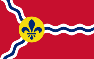
Although, also, while the I like the actual feart, design wise, I still feel like this city is not really known for fountains outside of the occasional chamber of commercy blurb and is certainly not the heart of America. It’s less silly and pompous than St Louis’ fleur-de-lis, though, and less post-mid century tacky than Portland’s whatever the fuck that is.
Re: The KC City Flag
Posted: Wed Oct 25, 2017 2:57 pm
by TheLastGentleman
chingon wrote:TheLastGentleman wrote:chingon wrote:I’d like to see that with the red and blue panels running directly into the corners and meeting in the middle of the bottom.
When you say corners, do you mean the corners of the flag or the corners of the fountain design?
3 triangles with the “feart” (fountain-heart) in the middle one: Blue\ White /Red
Although, also, while the I like the actual feart, design wise, I still feel like this city is not really known for fountains outside of the occasional chamber of commercy blurb and is certainly not the heart of America. It’s less silly and pompous than St Louis’ fleur-de-lis, though, and less post-mid century tacky than Portland’s whatever the fuck that is.
I had some relatives from Seattle visit last summer who made a game of sorts out of spotting fountains, so they must have been aware of the "city o' fountains" thing, or just noticed how many fountains there were. Either way, I think it shows that the label still has relevance. Purely anecdotal, I know, but still.


